Coursework
Wednesday 3rd May 2023
Coursework
To explore possible tasks and research similar products
Magazine
- Create a front cover and a double - page spread article for a health and fitness magazine aimed at an audience primarily of 14-18 year olds.
Front cover ideas


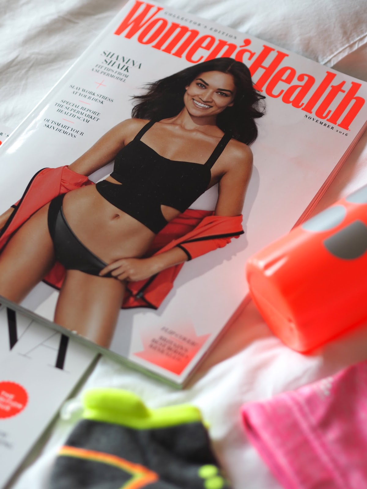
1. Magazine has a colour scheme of pink, red and white with similar fonts. The main image is on the right instead of in the centre.
2. Mid value because the front cover is glossy and thick however the pages aren't glossy but are still thick.
3. The '40+' signals it is for older women to lose weight and become 'sporty and stylish'
4. Colour scheme is red, pink, and white and is quite big to catch attention with a bold font.
5. The women is supposed to represent an older women who looks younger so older women would be interested
6. The target audience is 40+ an it appeals to them by showing an older lad appearing younger but also talks about cooking which stereotypically is what older women are interested in.
7. The logo "fit & well" is on the DPS but also some have the same or similar colour schemes.

1. The colour scheme is very bland and there is one cover line and the font is very plain and small.
2. Low value because the front page is a little thick but not gloss and the pages are very thin.
3. The main cover line talks about food and fitness so it could be aimed to more healthy eaters.
4. The font is very plain and the colour scheme is black and white, going more for an aesthetic going for a target audience of around 20.
5. Same to question 4.
6. The main cover is a young adult in a bikini and top looking happy making other adults interested.
7. Same as question 4 and 6.
8. It has the same font all throughout.
My magazine ideas:
Style - Very summery and beach included image but also on double page spread includes healthy food.
Typography - Plain font but very big with lots of cover lines
Image - Full body shot with background beach and all about being healthy and happy.
Masthead - Big and bold might be plain colour or pastel colours to match the summer style.
Cover layout - One main image with lots of cover lines
Content - Summer and being healthy and being at the beach
Colour palette - Pastel colours such as light blue, yellow, pink or even white.
DPS layout- Lots of healthy food and writing about being happy and healthy and enjoying the food
Summer style because a lot of teenagers feel better in the summer and the sun.
Wednesday 14th June 2023
Magazine planing:
Name - health and fitness
Tagline -
House style -
Colour palette - white, pastel pink, pastel yellow
Cover image ideas -
Cover lines -
Wednesday 21st June 2023
Adobe Illustrator
Explore the use of adobe illustrator to create a magazine masthead or logo.


Target Audience: Higher class, High educated, Technology professional, Older audience, Male audience ( business is dominantly men, stereotypical talks about sports ) , Ambitious audience

Target Audience: Women ( front cover, talks about relationship, beauty, swimsuit which stereotypical women are more interested in ) , 25-40 age, Fashion, Looking good,

Target Audience: Male ( front cover, Daniel Craig is seen as attractive yet he has clothes on ) Looks serious, Older age range 30-50, Wealth, Inspirational, Humorous and amusing, People who like films.
My magazine:
- 14-18 year olds
- Female
- Waitress
- Any race
- School
- Interested in the beach, going out, animals, summer, runs and being active, eating health, music
Hobbies - Going out for runs and going to the beach
Social media - Influencer / many followers
Friend Description - Outgoing, Independent, Family and friend oriented, Sporty
Why would my product appeal to them - Very summery , healthy food and about runs and staying active
PLANNING:
Name - Health & Fitness
Tagline - Health for the summer
Colour palette - White, light grey, light pink, pastel colours
Make it appeal to my audience - Aesthetic, fit their interests.
Representations - Front cover will be summery and bright but aesthetic, beachy, same age group.
Possible cover lines - Healthy eating!, Fit for the weather
DPS article subject - Healthy eating and runs and staying active
Information - Barcode, Release date, Price


DPS IDEAS
Wednesday 12th July 2023
In-Design
To explore and understand how to use InDesign for magazine layouts

Wednesday 13th September 2023
Coursework review
To recap brief criteria and to explore how to create effective representations


Cover - Big same font as most female fitness magazines. Cover lines on the sides. use a teenager so they have someone to look and relate to. Big colourful colours for stereotypical girl magazines.
DPS - Healthy eating and how to eat healthier if you are struggling and show healthier foods and why.
Genre - It will be about healthy eating and getting into healthier habits.
To do list:
- Cover image
- Cover lines
- DPS Images
- DPS writing
Wednesday 27th September 2023
Do Now:
Cover lines:
- Better exercise means better mindset
- Eat healthier
- Keep fit
- Be confident
Wednesday 4th October 2023
How i am going to target teens:
- Use a teenage front cover.
- Use stereotypically feminine colours to target girl teenagers.
- Use an image that will target girls into getting and eating healthy.
- Use a teenage girl on the front cover to interest them more by using someone in their age range
DPS:
Subject: healthy food
How it is going to appeal my audience:
- Use teenage girls to inspire my audience to buy the magazine
Representations:
- Healthy teenage girl
- Healthy food
- Feminine colours (stereotypical)
Layout:
Front cover:
- Feminine stereotypical colour palette
- Teenage girl main image
- Barcode
- Price
- Masthead
Wednesday 8th November 2023


RESEARCH:
ReplyDeleteGood research into conventions but analysis lacks detail
TA PROFILE:
Basic but good
PLANNING:
A good start - which masthead are you going with?
I'd like to see more about how you're going to target teens.